

Procedural Identity Design
GEN×ART is a bi-annual festival of generative and procedural art held in Amsterdam, Netherlands. I designed the festival’s identity system around generative principles, enabling infinite variations in print and motion. The result is a brand that remains instantly recognizable while never repeating.
Dynamic Posters
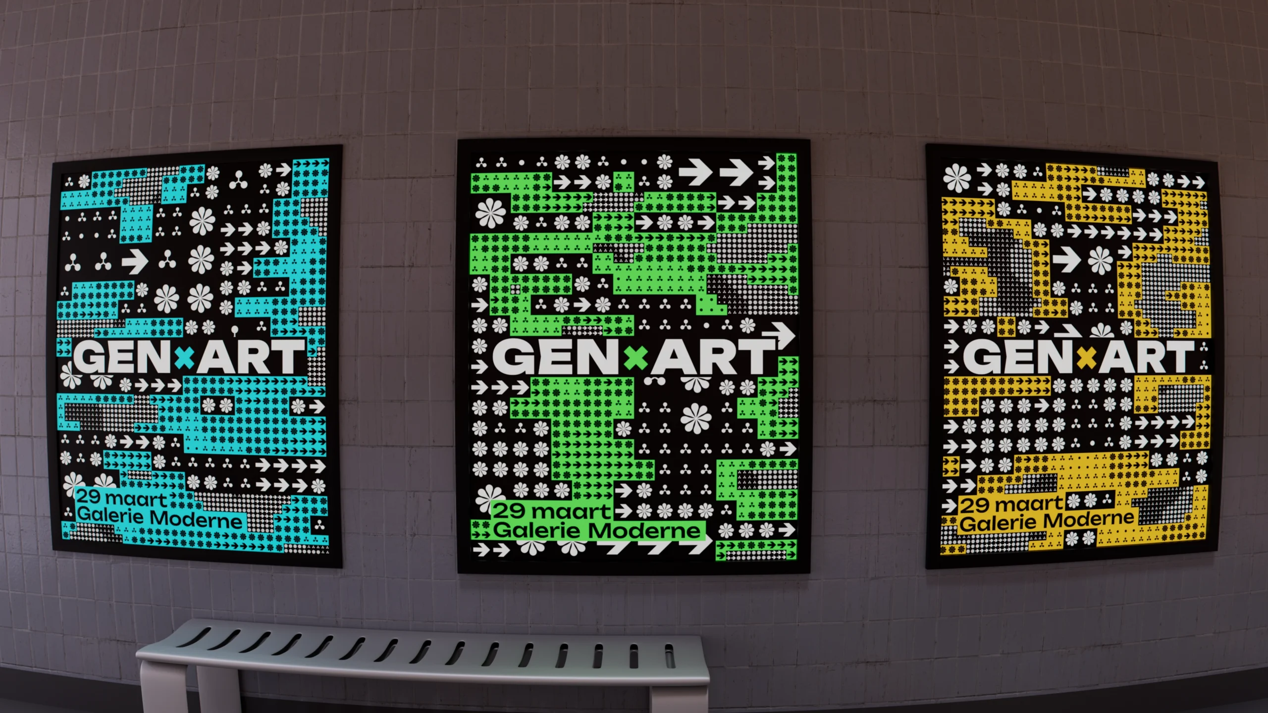
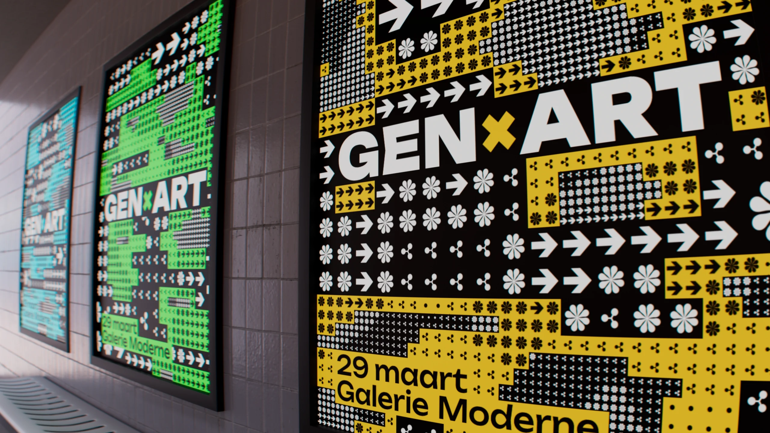
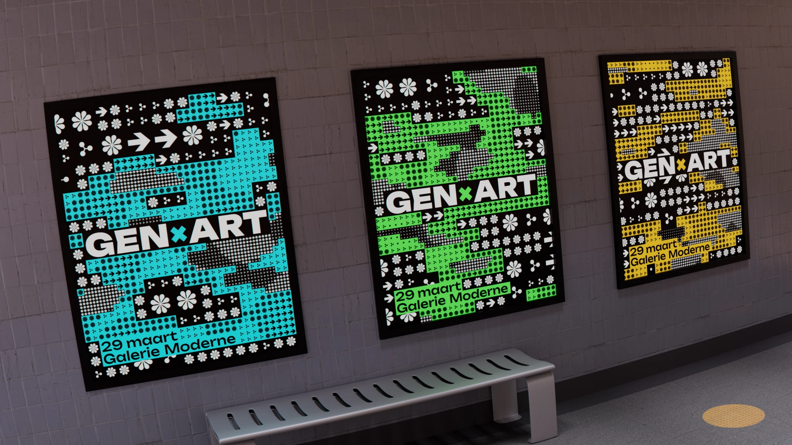
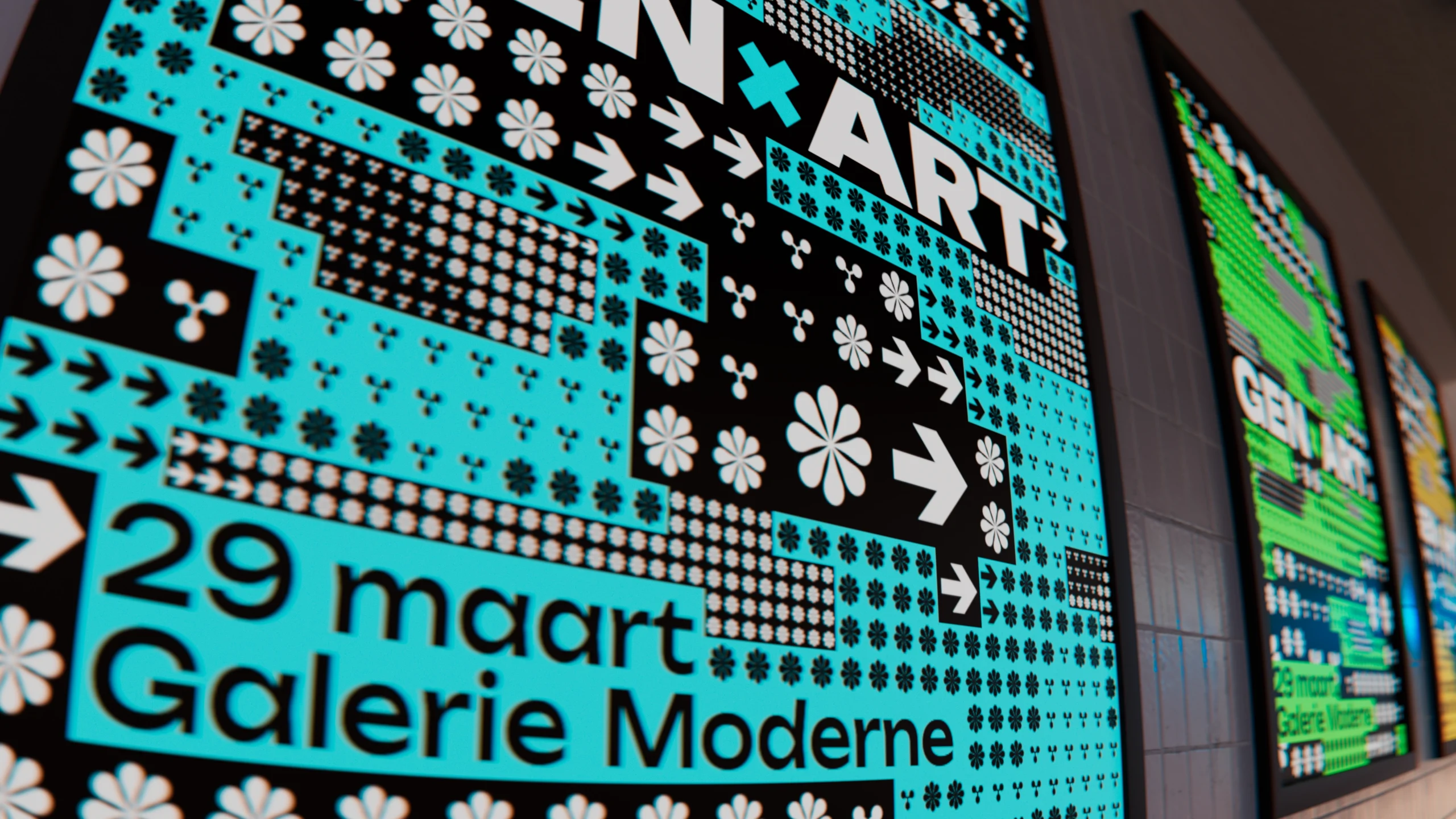
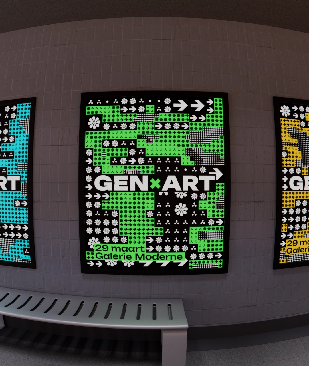
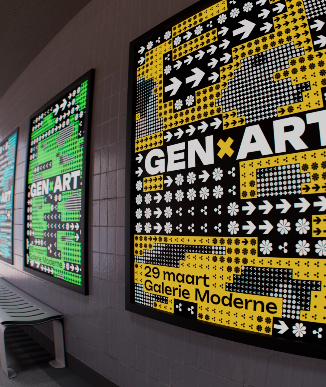
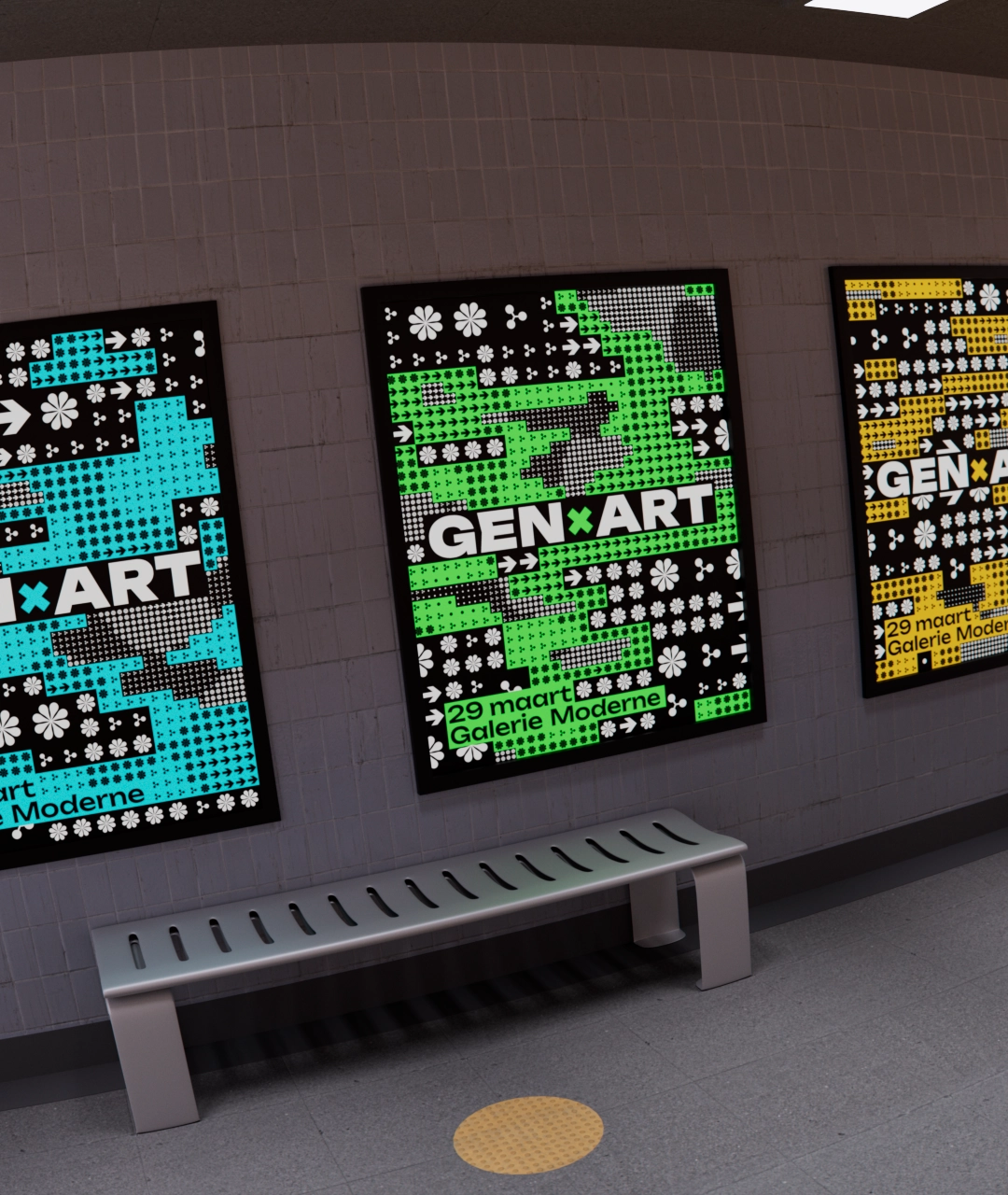
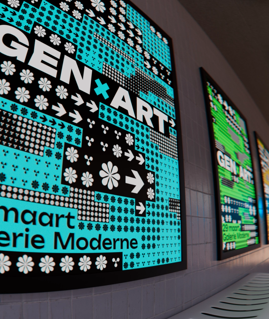
Netherland’s wide adoption of digital displays afforded me the opportunity to design festival’s posters as generative motion pieces. I kept the palettes clean and simple, restricting them to three colors, while allowing the procedural patterns to continuously evolve and morph.
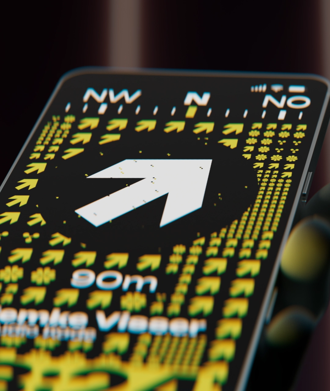
The grid on the posters fluidly scrolls through the canvas, together with the arrow symbols indicating the direction towards the event location.
Event Venue
In addition to standard signage, I have created two standout features for the venue where the festival is held.
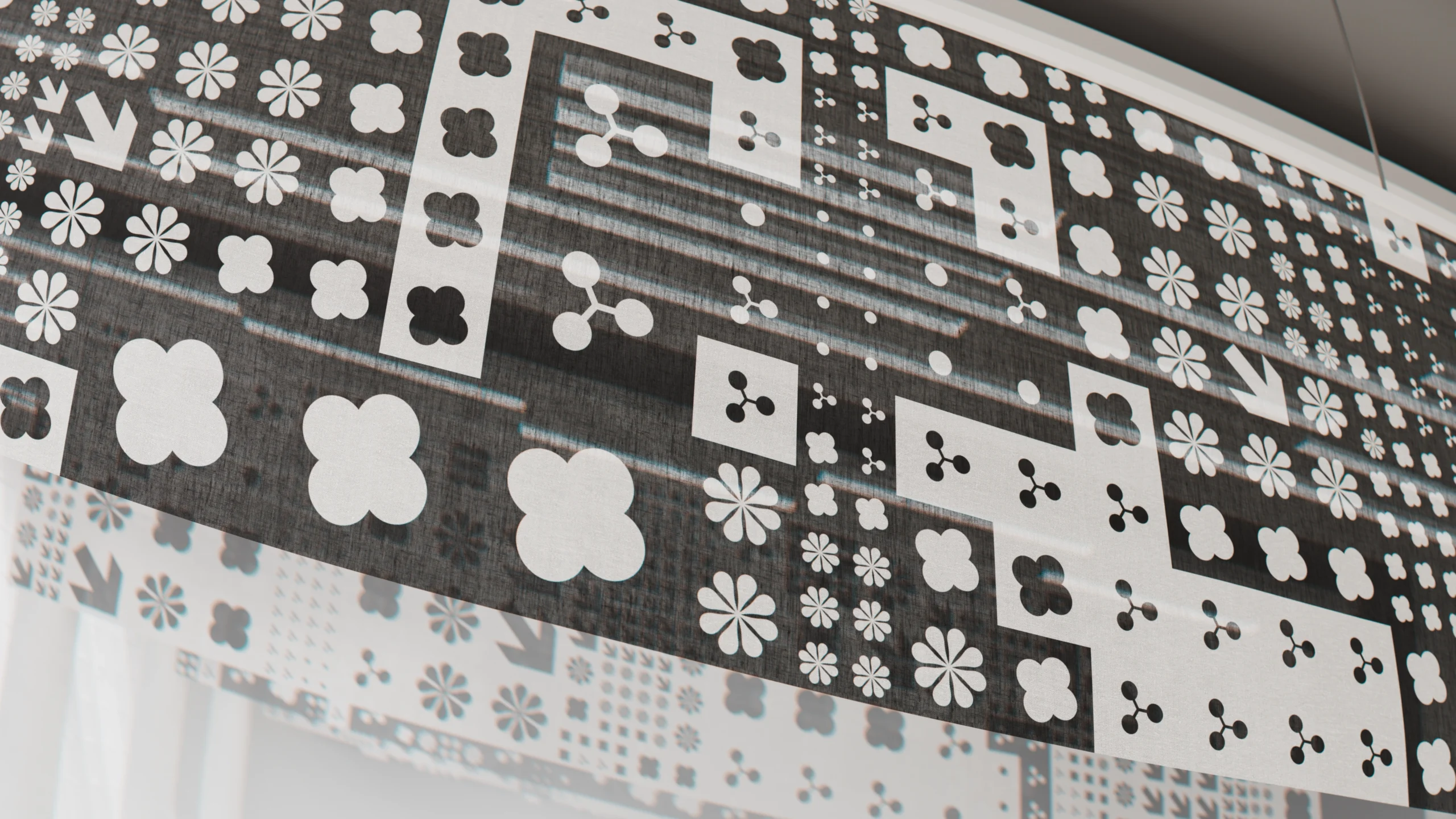
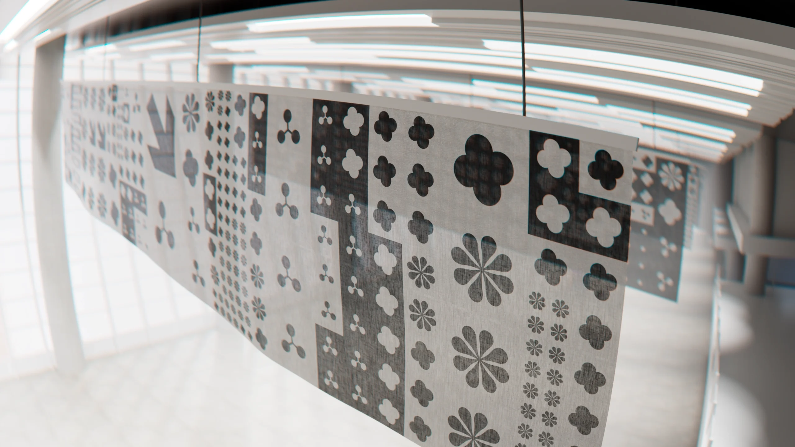
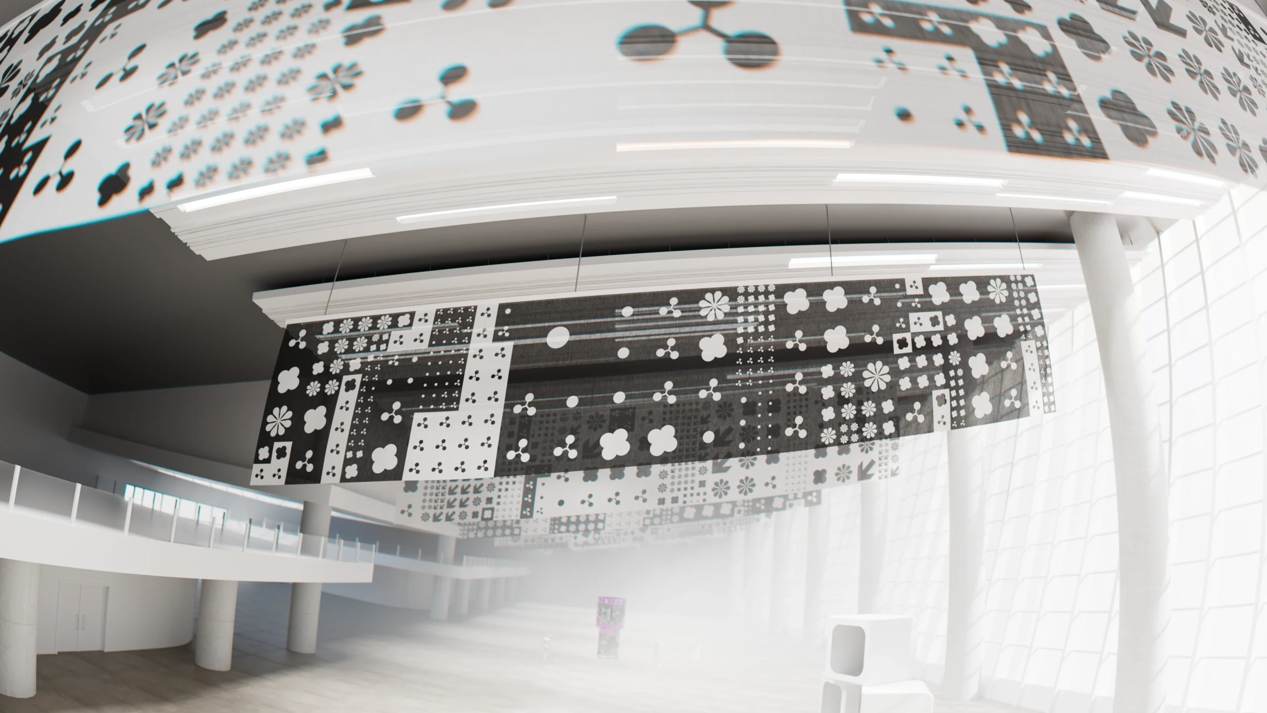
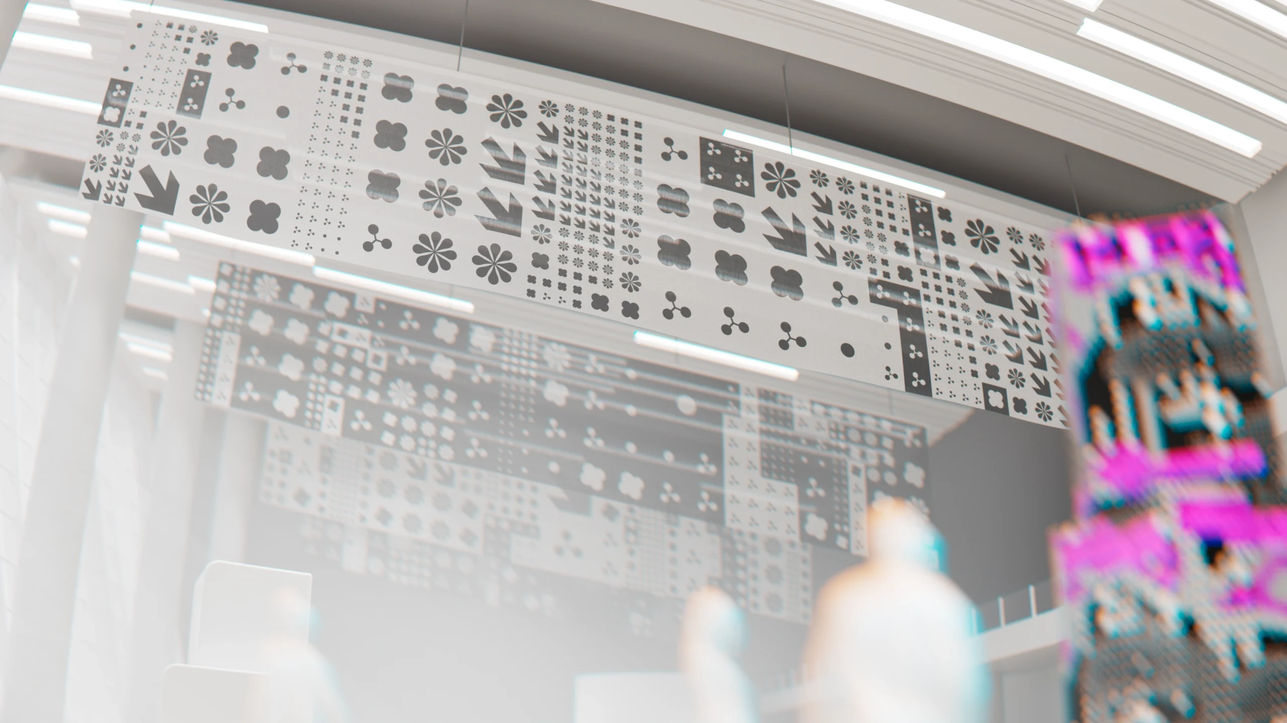
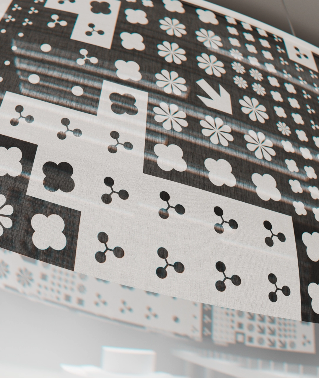
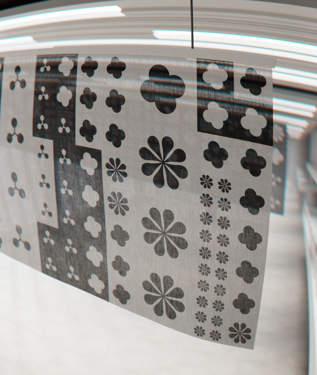
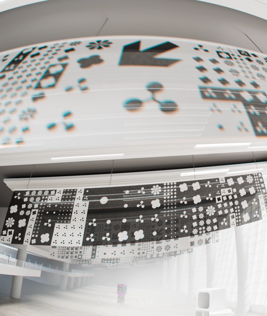
A series of black-and-white canvas flags gave the design system an opportunity to be tested in a low-fi, non-digital format. A total of 24 flags were created – each with its own unique arrangement of symbols.
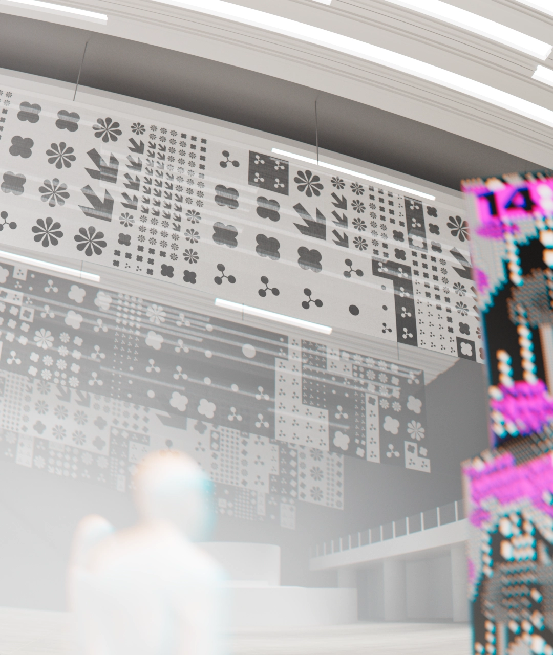
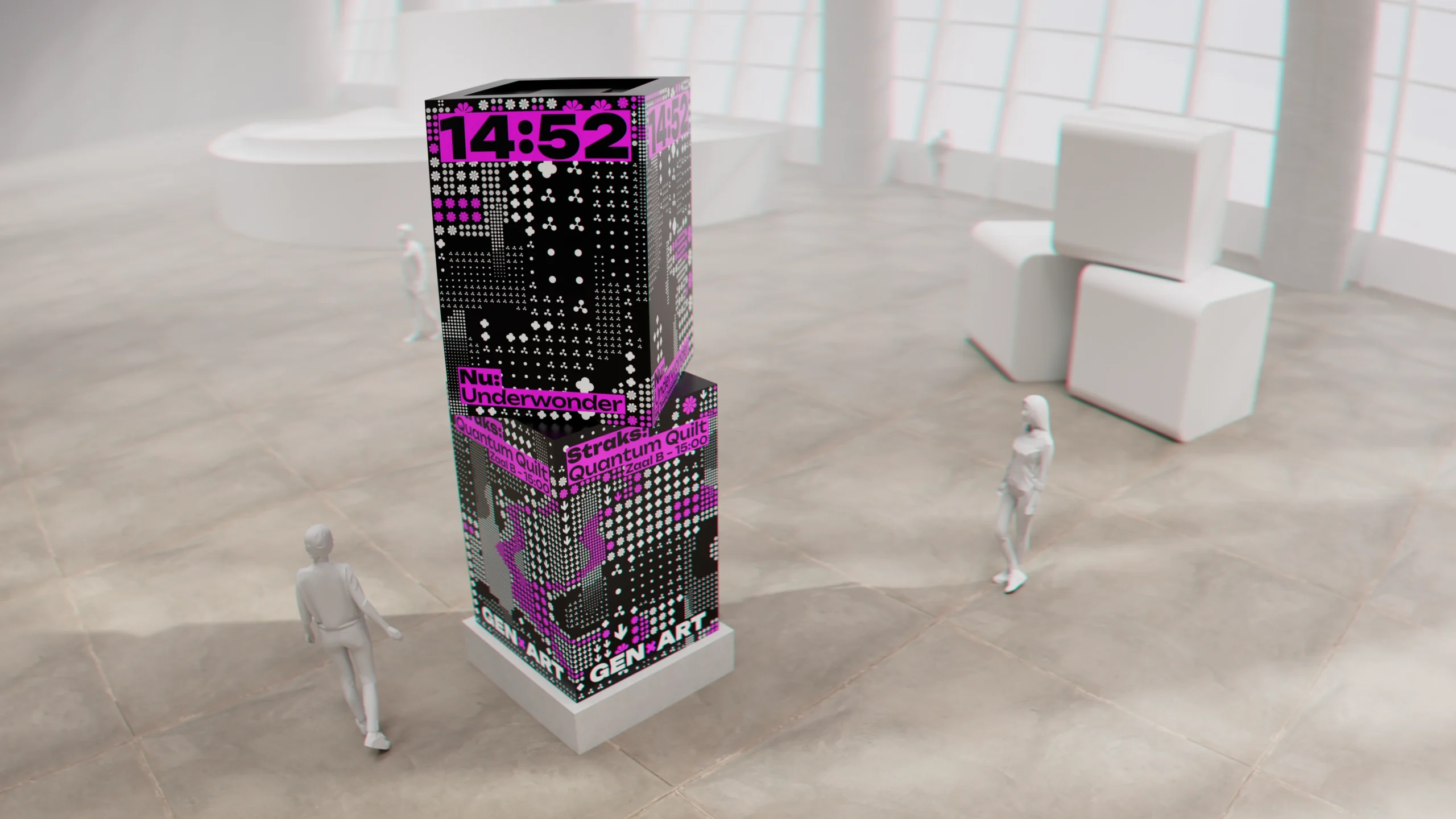
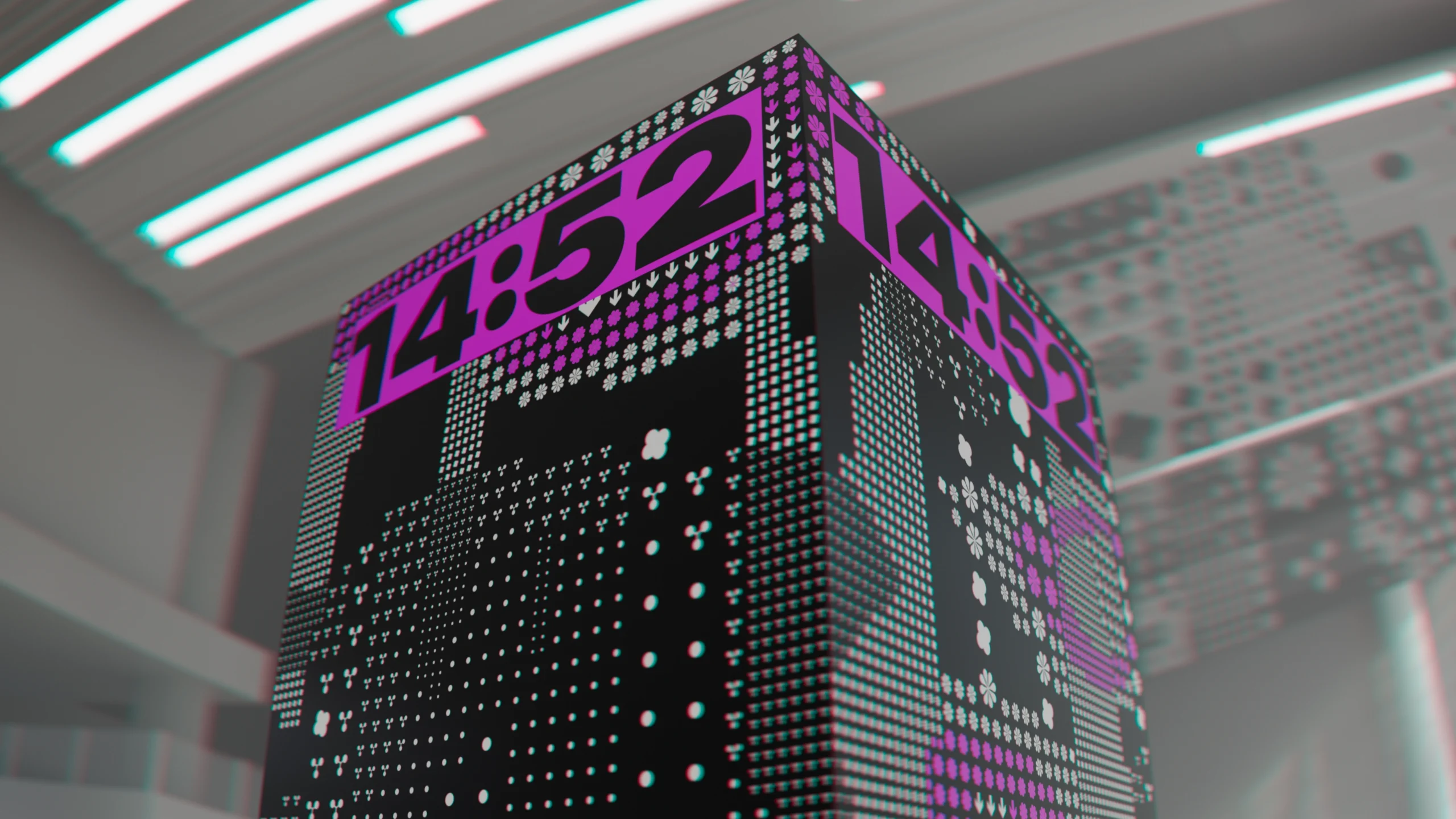
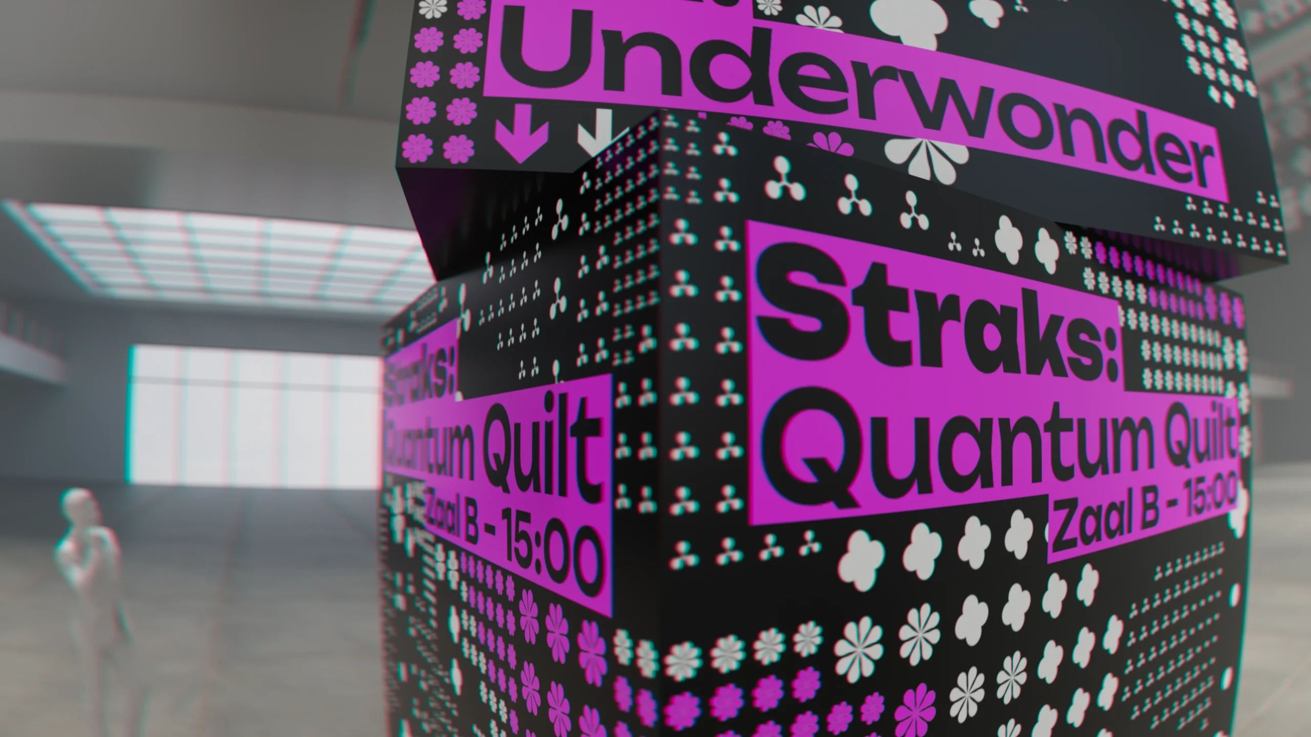
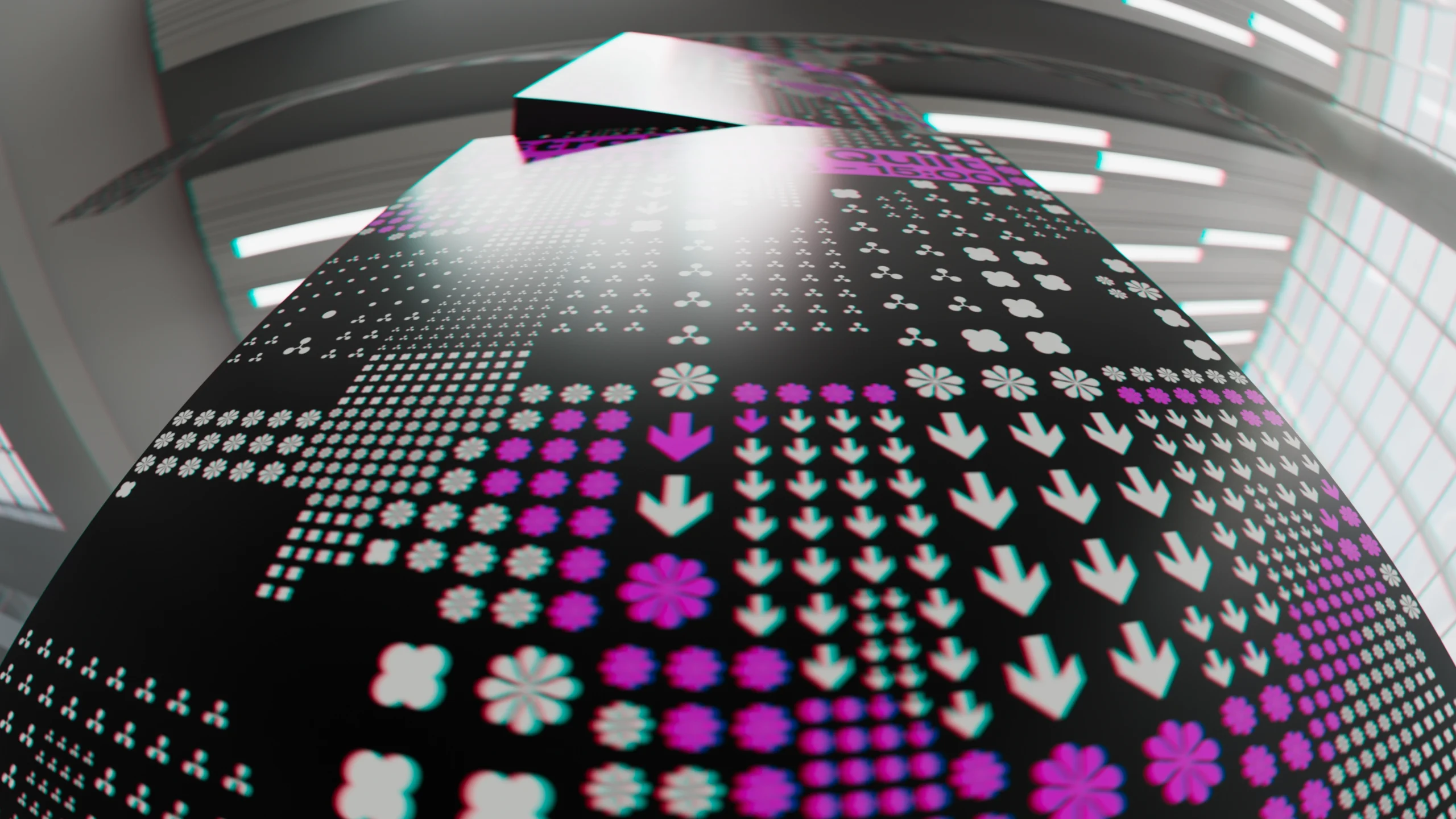
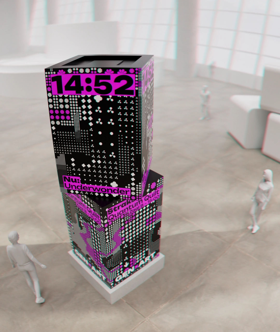
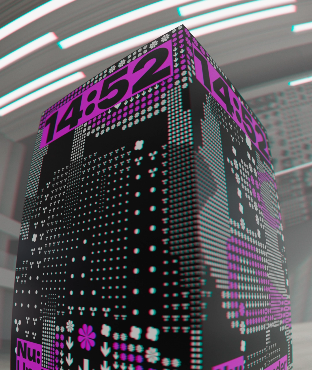
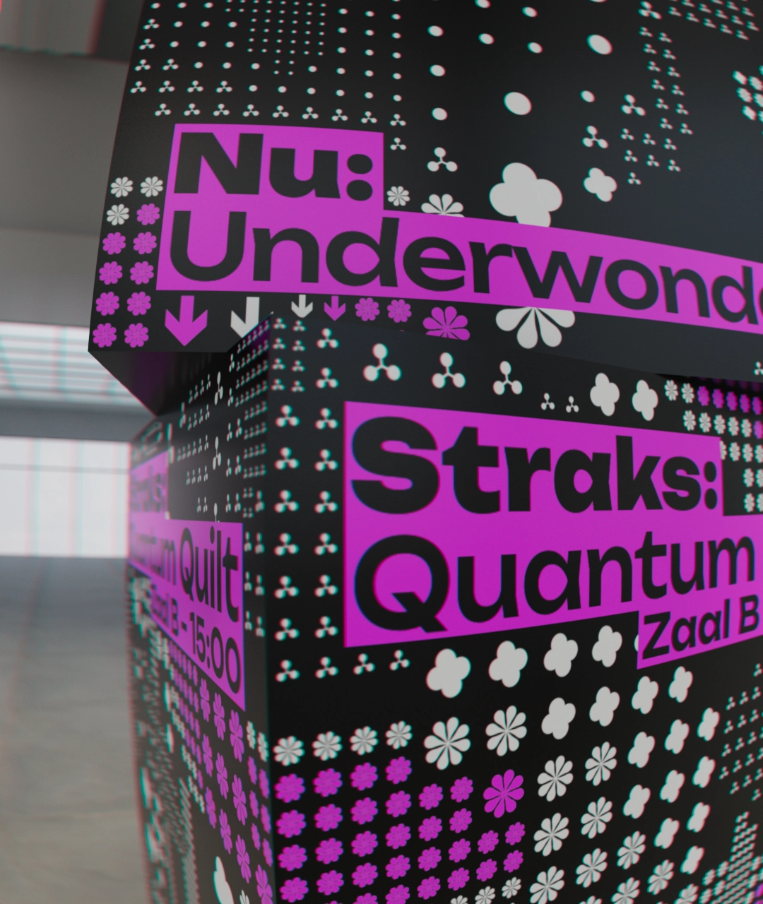
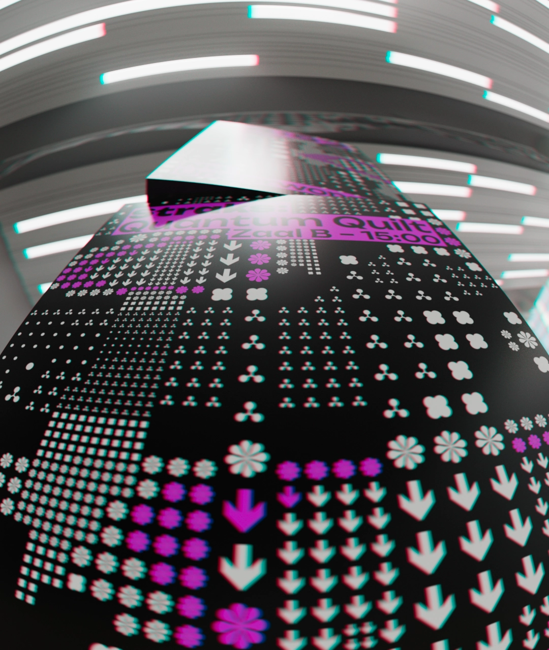
In the center of the venue, visitors are welcomed by a kinetic information board. Combining elements of a turret clock and a poster pillar (aanplakzuil), the structure is in constant motion – both physically and digitally.
The top clock section rotates, displaying time as well as information on current ongoing event. The bottom part advertises the next upcoming event (show, talk, performance, etc.). An animated procedural pattern wraps around the structure, drawing attention to the announcements.
Mobile App
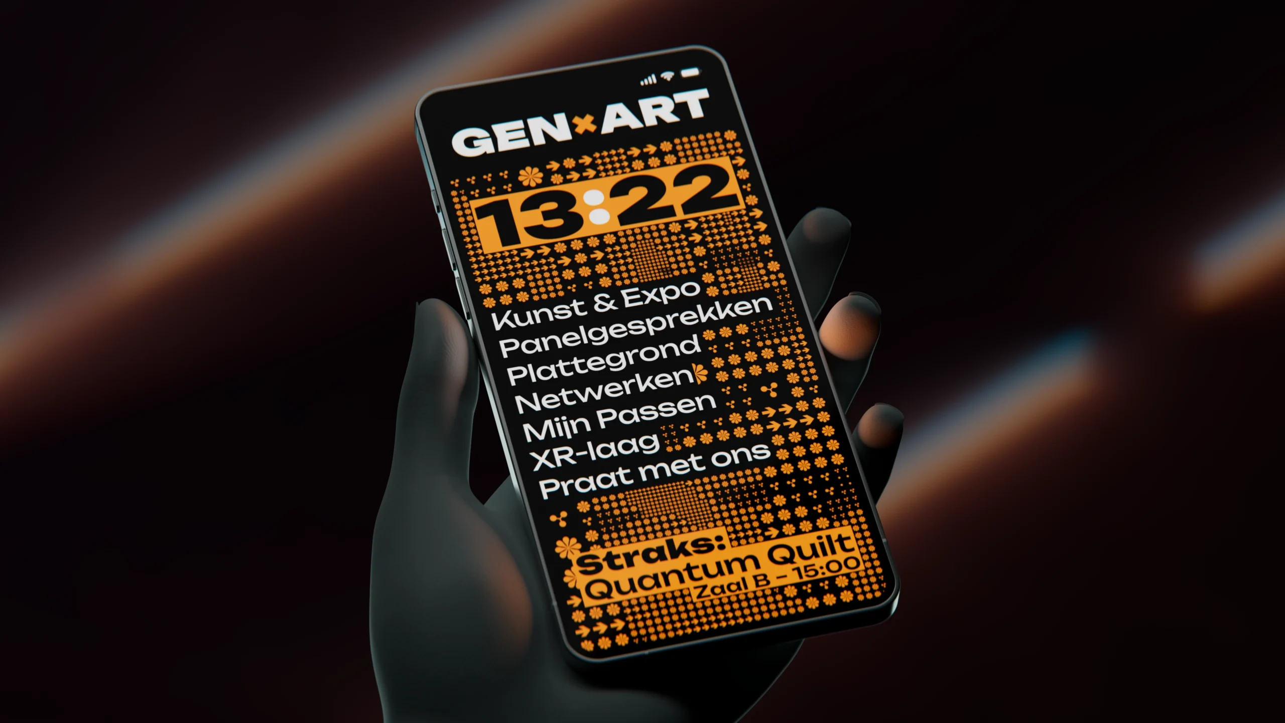
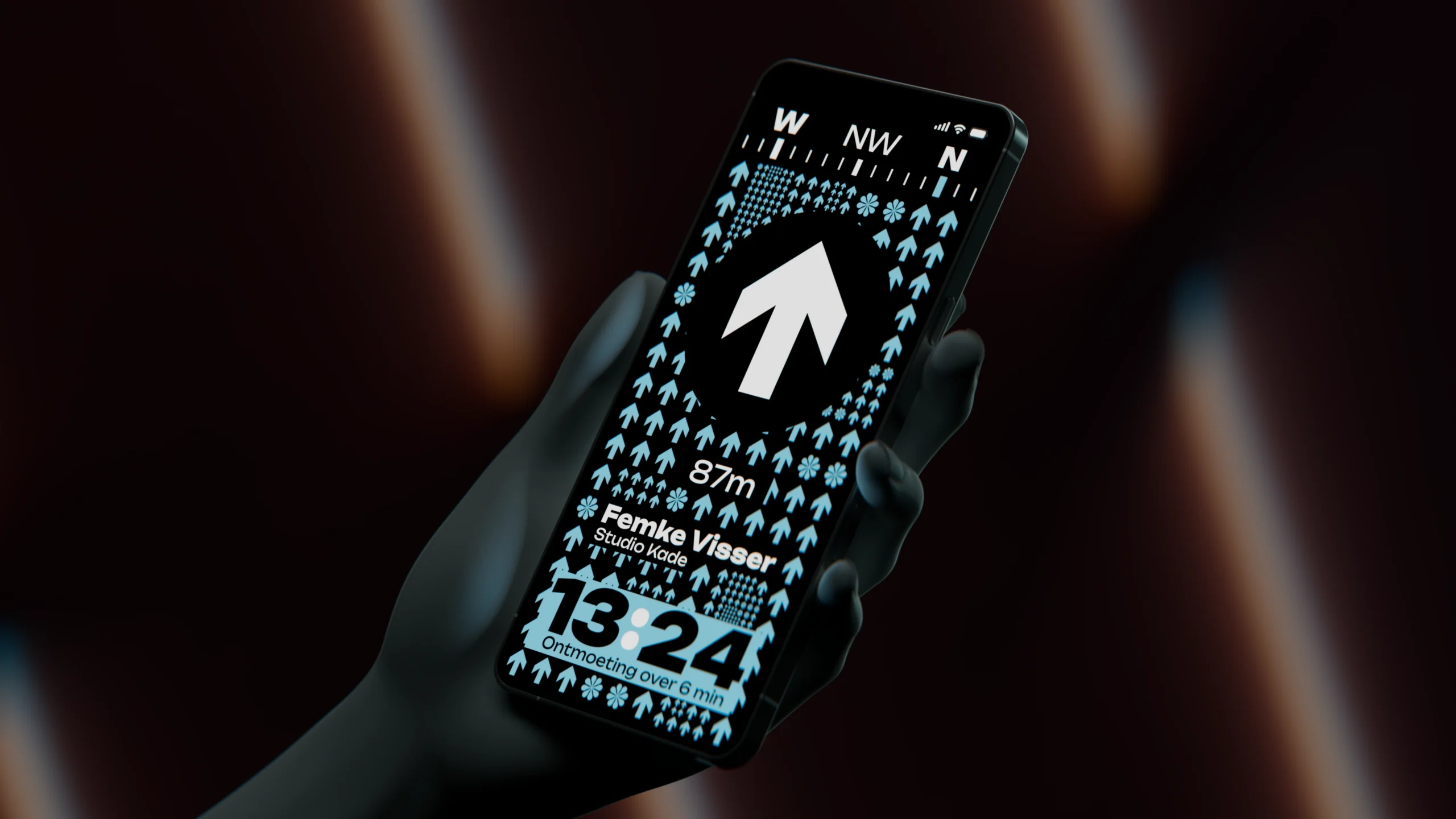
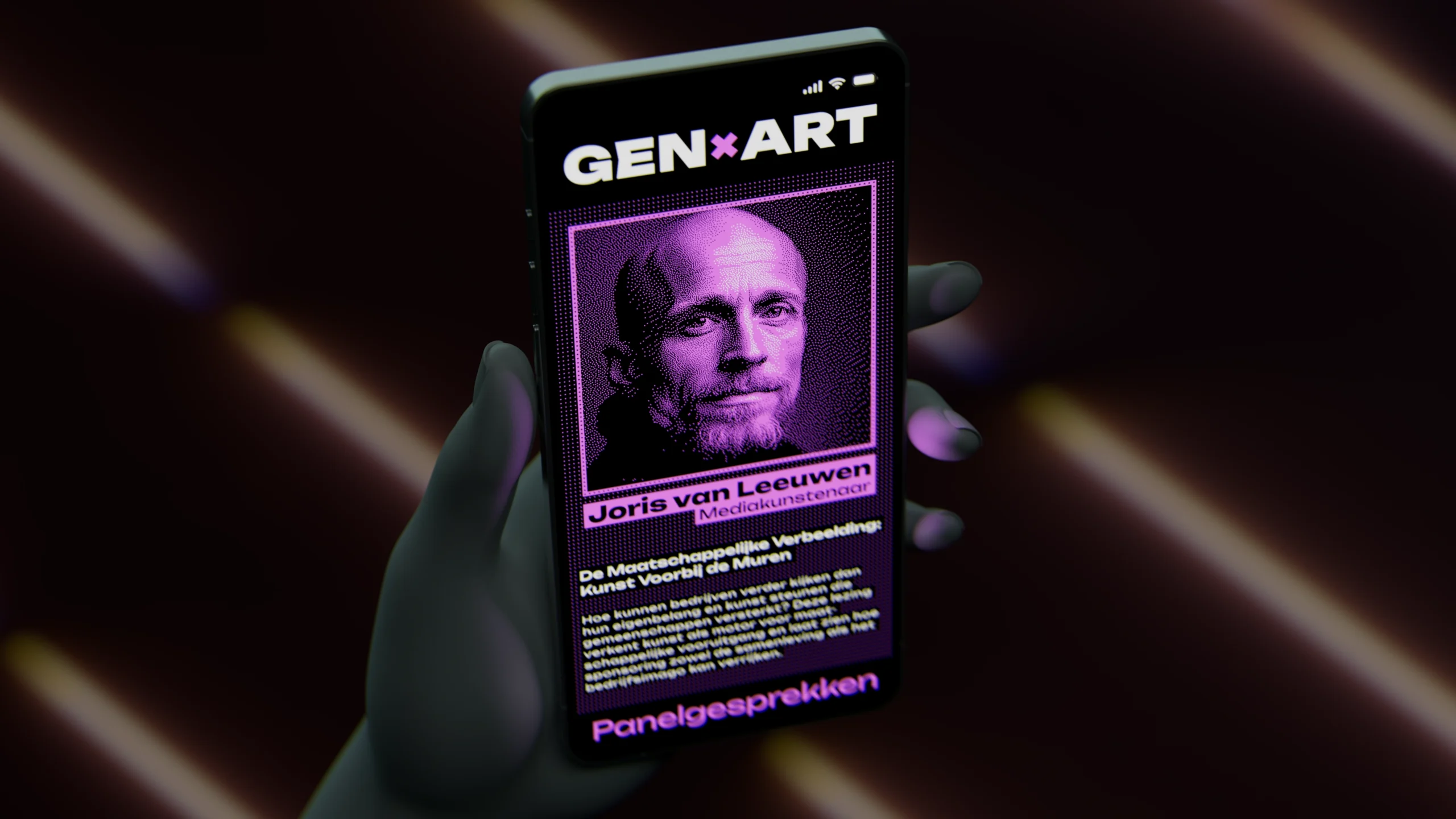
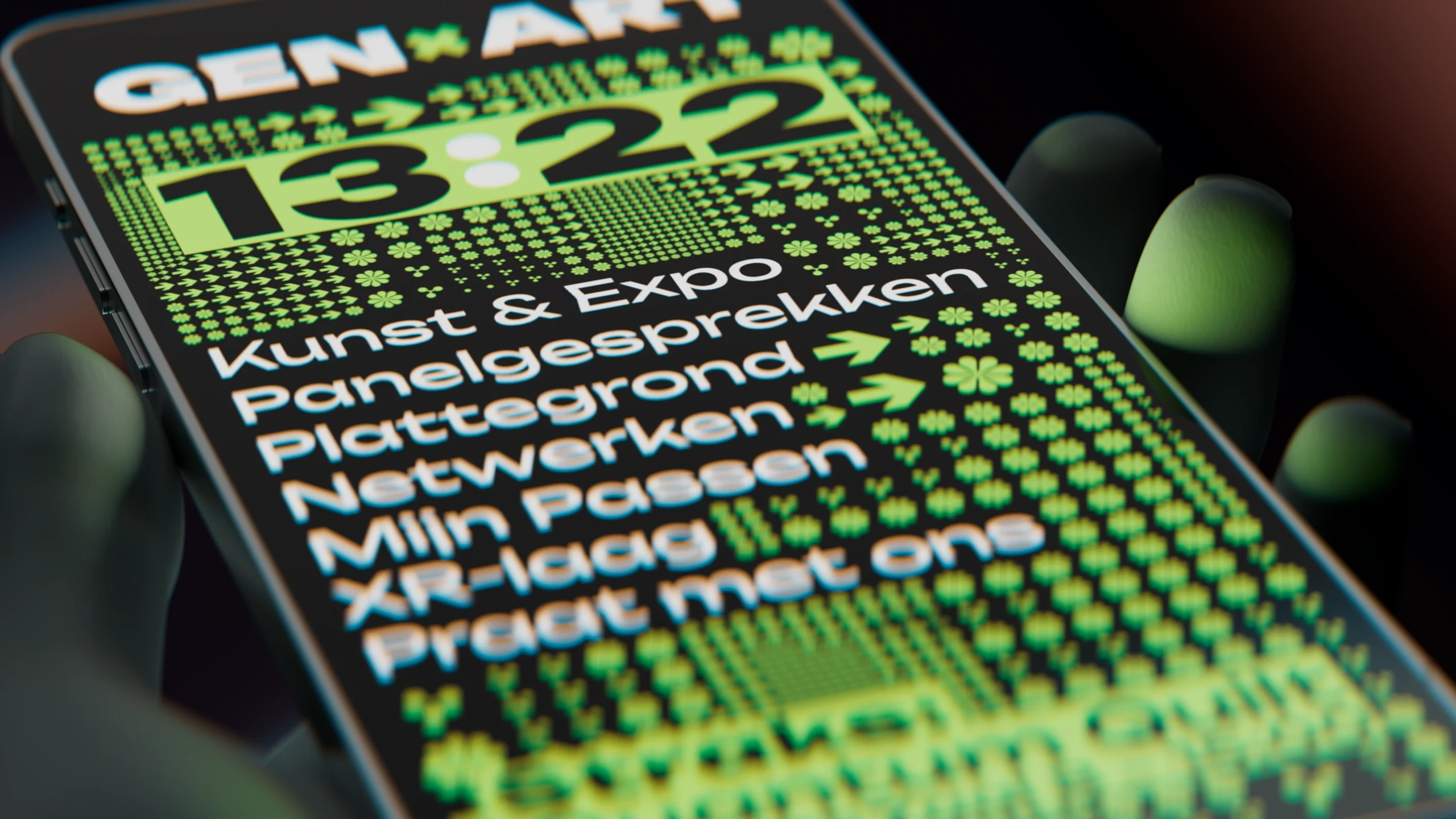
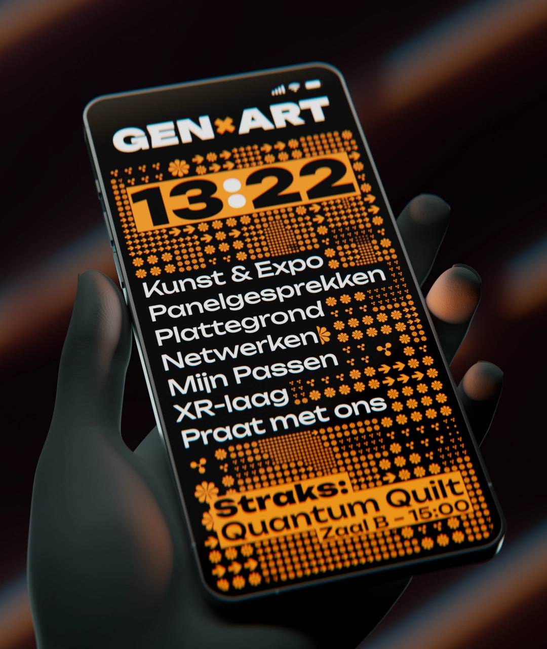
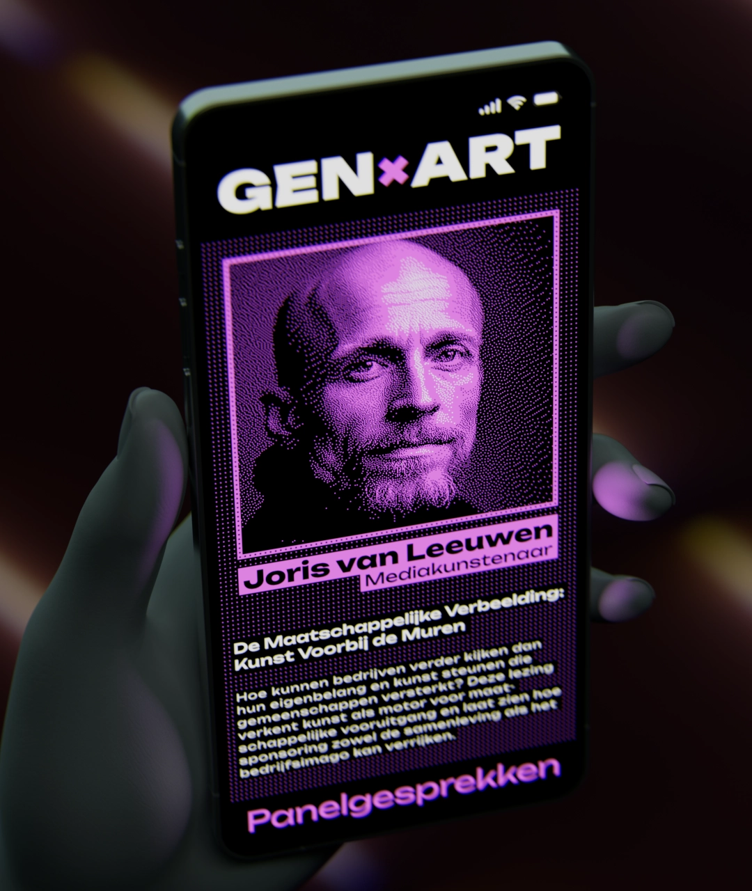
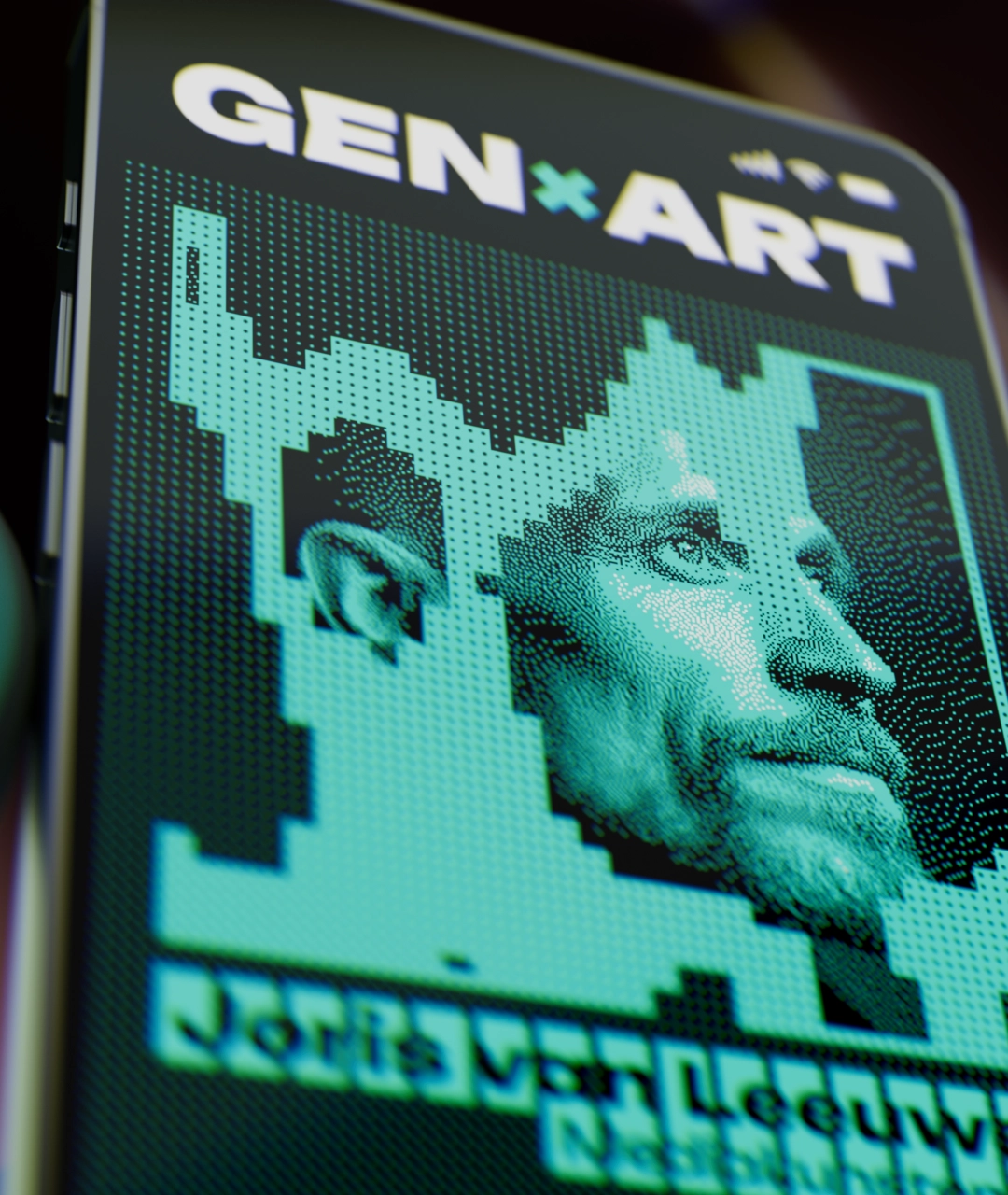
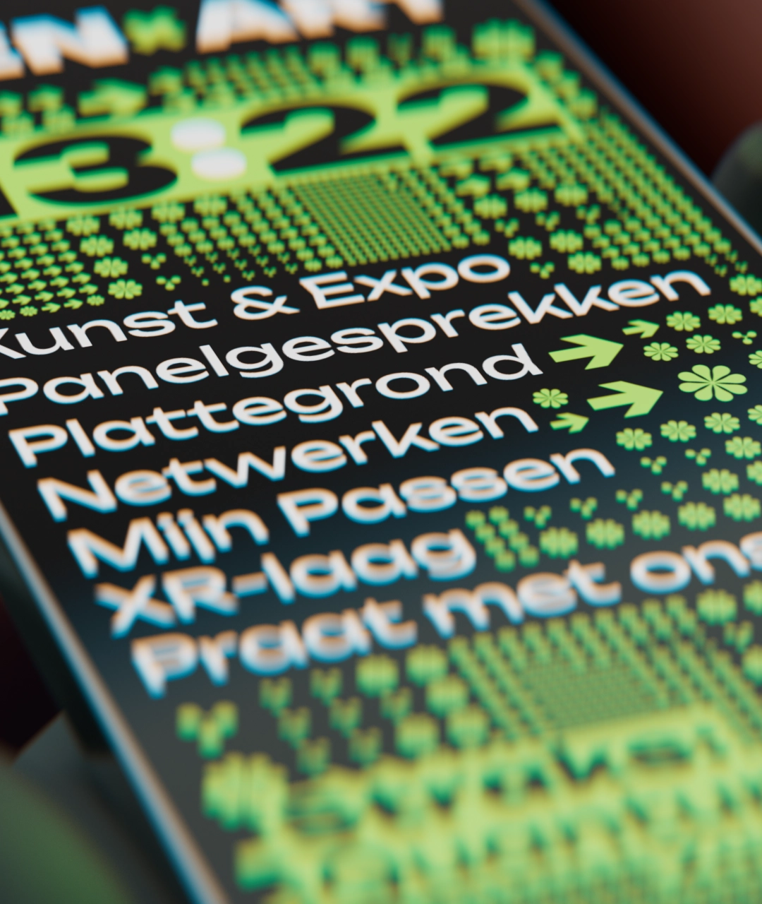
In an era where majority of mobile software mirrors the same underlying design principles, the GEN×ART is unapologetically committed to the festival’s design identity.
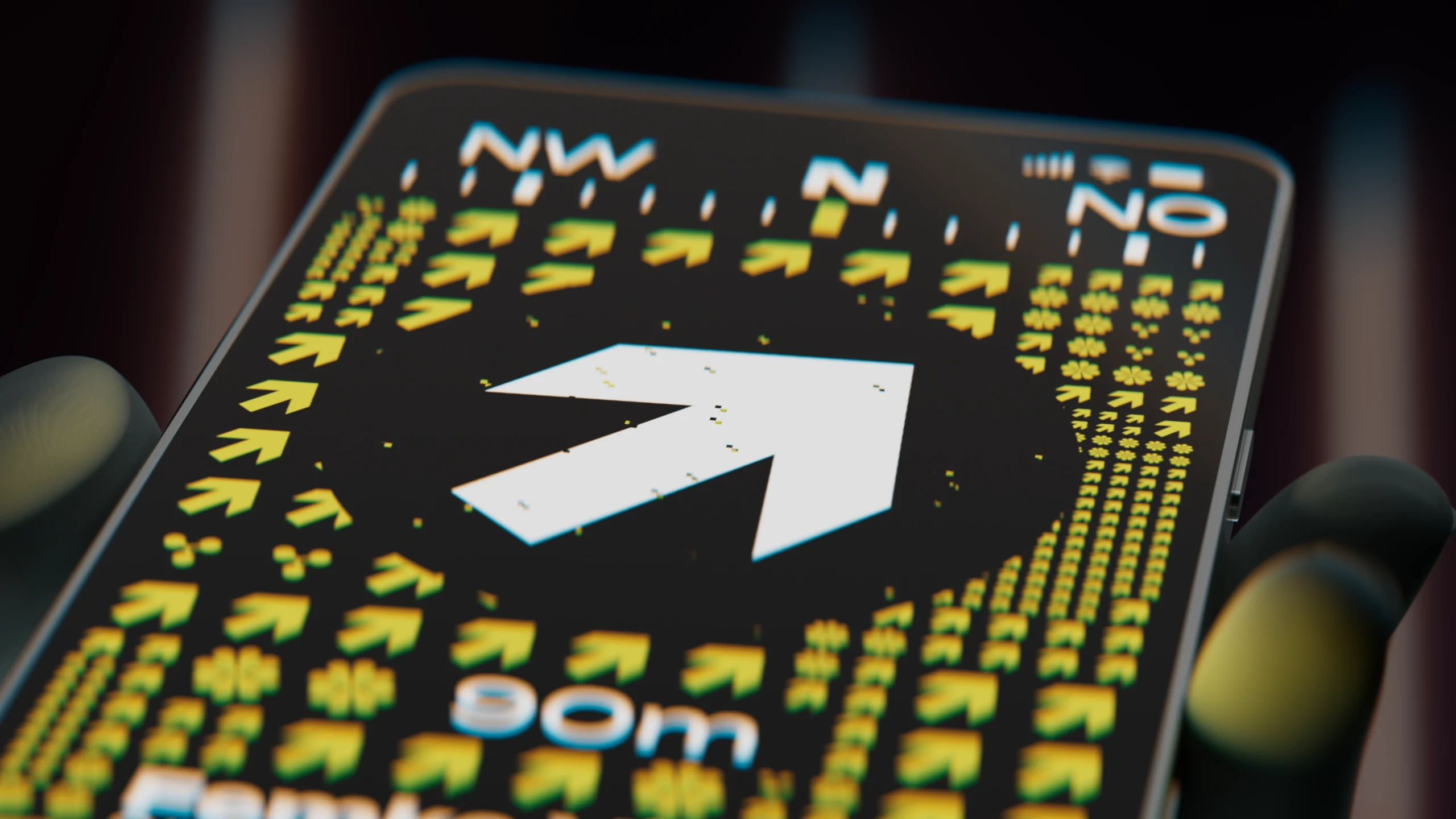
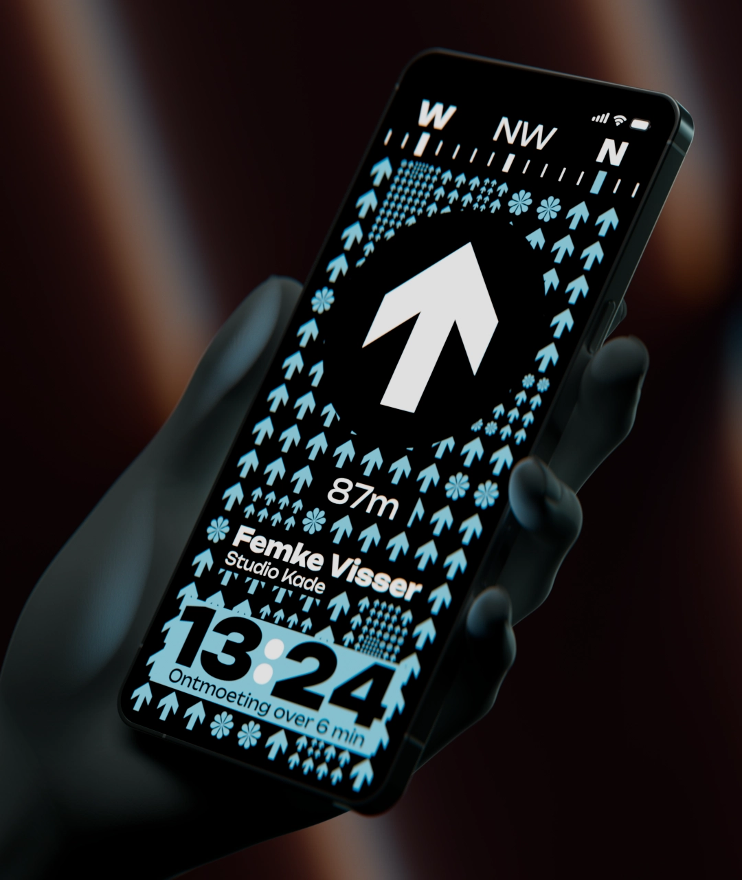
I’ve lowered the contrast of the symbols by avoiding black-and-white pairings, reserving the highest contrast for key screen elements only. To keep the app fun and festive, the accent color continuously cycles through a gradient of hues. These are driven by daily event themes, weather, proximity to contacts and a number of other factors selected by the user. Naturally, one can also program in their own colors, or disable the effect completely.
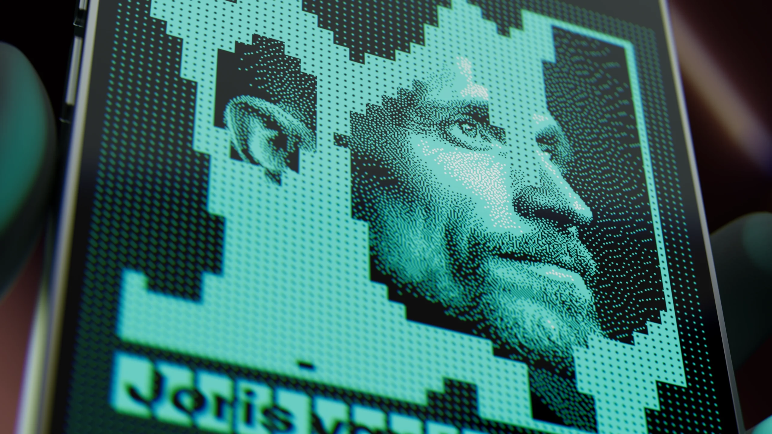
The grid system serves functions beyond pure aesthetics. It can subdivide to create dense matrix for pixelated graphics, or use its symbols for additional tasks, like navigation.
Typography
The entire typographic system of GEN×ART identity is set in a single typeface: Polkadot Network’s Unbounded. It is a sans-serif typeface commissioned (and on-chain funded) via the Polkadot treasury, making it one of the earliest (if not the first) open-source fonts supported by blockchain funding. The project is a collaboration involving Studio Koto, NaN, Parity Technologies, and the Web3 Foundation, created for use by the global Polkadot ecosystem.
Unbounded combines characteristics of grotesque and humanist sans serif forms, achieving a balance between mechanical and organic features. One of its visually striking features is the use of chevron-shaped stems in certain glyphs, which breaks the rhythm of purely straight verticals and introduces a degree of visual dynamism.
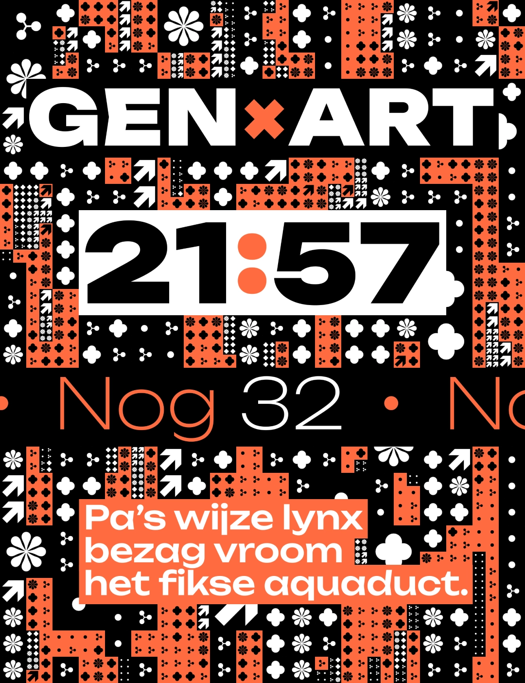
Unbounded strikes a rare balance between character and longevity—it’s distinctive enough to stand out with its sculptural details and dynamic letterforms, yet its clean geometry and restrained rhythm give it a timeless quality. The result is a typeface that feels fresh and exciting today, while remaining versatile and enduring, unlikely to age into the look of a passing trend. With over 400 supported languages, unique figure building system and variable weight, this typeface is ready for any copy thrown at it.
The backgrounds always feature a high-contrast, dynamic grid of geometric patterns. To maintain legibility, the text is always rendered within opaque background rectangles – sized to match the grid spacing.
Dynamic Pattern Grid
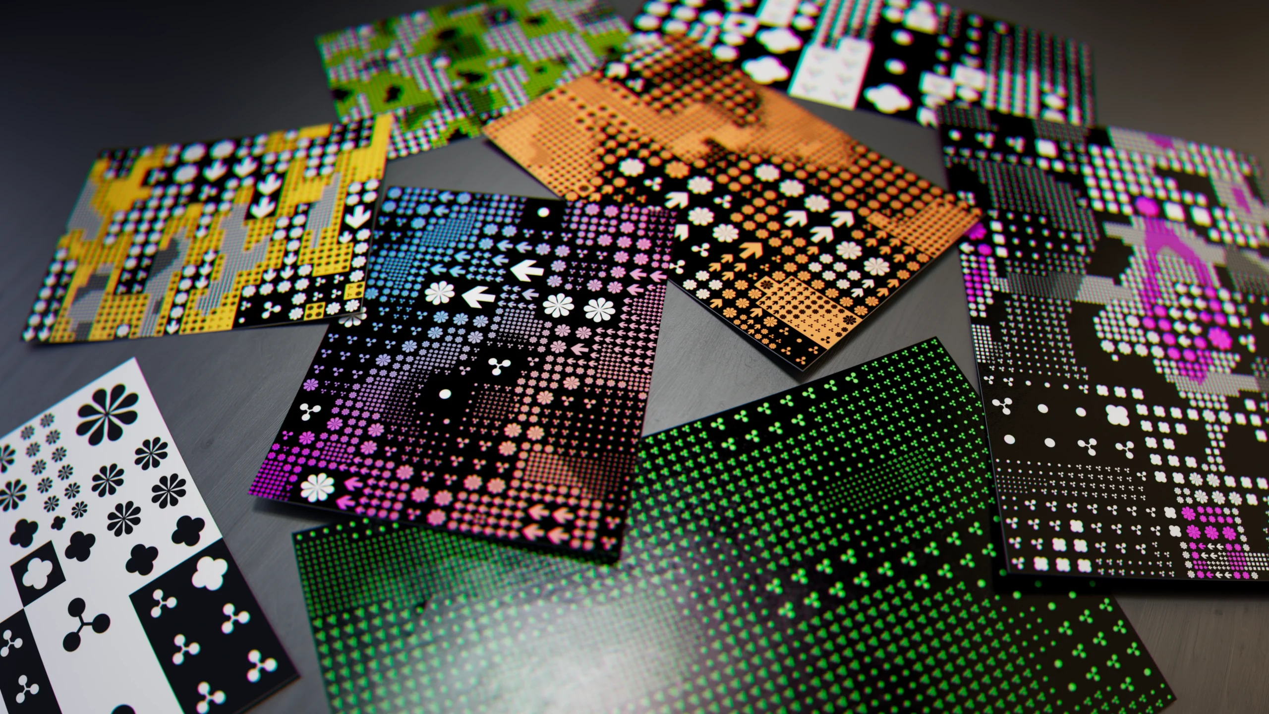
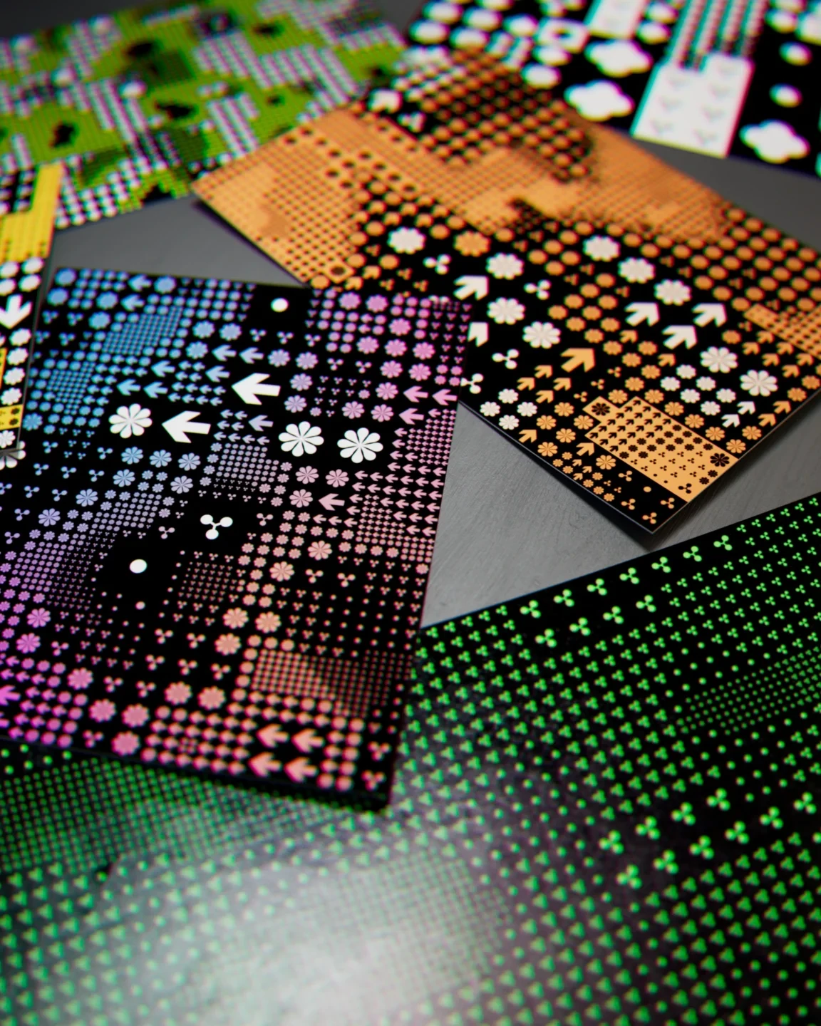
The animated pattern mosaic at the heart of GEN×ART identity is comprised of several basic building blocks. Each element is very simple on its own. When combined, they give designers and production artists endless options for customizing the final art direction; complexity out of simple set of principles.
At the heart of the system are six geometric symbols. Five of them are based on a circle element – arranged with radial symmetry and touched up by hand to walk the line between graphic and organic. The sixth element is a bold, angular arrow. It contrasts the remaining elements – for both aesthetic and functional reasons.
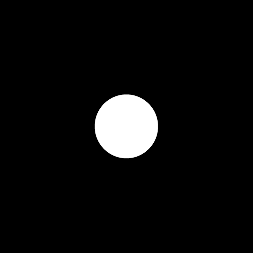
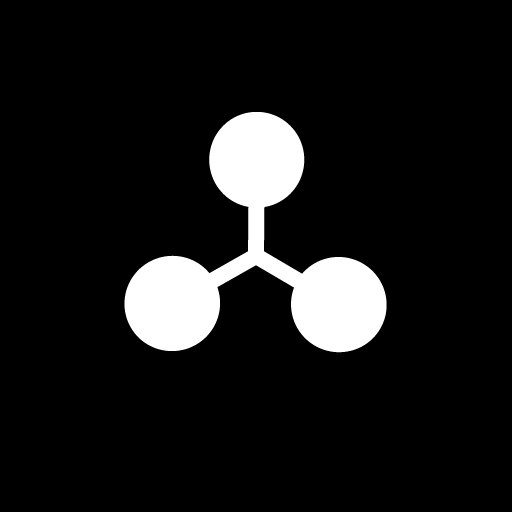
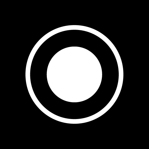

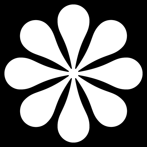

Each symbol has a different ratio of white area to black area. That relationship can be interpreted as symbol’s brightness.
When art directing patterns, a designer can map selected symbols onto different segments of the black-to-white (grayscale) luminance ramp. Modifying the assigned ranges will decide where, and how frequently each symbol appears.

These rules are then applied to a grid of tiles and driven by a procedural noise. The noise can be animated in a myriad of ways – from evolution and translation to contrast changes and scaling.

To break down the monotony of regular, identically sized tiles, another procedural noise is applied, driving tile subdivisions. Once again, the grayscale value of the noise determines the strength of the effect – subdividing each tile up to 8 times (creating 64 tiny tiles in the place of one large one).

The two noises driving the pattern can be combined using Boolean operators and masks in order to isolate portions of the canvas. Once isolated, the symbols can be recolored, inverted, substituted or even turned off. Alternatively these effects can be driven by sensor data, or further additional procedural noises.
Combined with traditional scale, rotate and translate controls, the system gives the designers and production artists an infinite canvas for experimentation.